

How Your Website Design Affects Your Sales
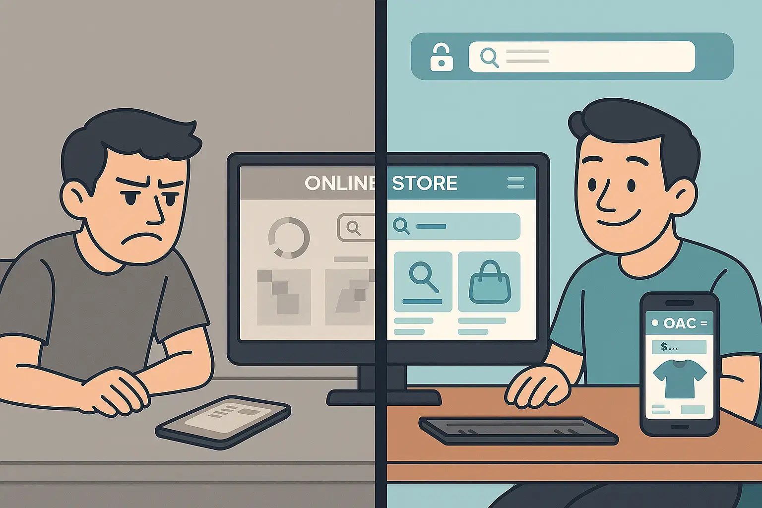
A couple of years ago, I landed on a friend’s consulting site to schedule a quick call. The URL looked promising, but when the page loaded, I was greeted by a cramped layout, tiny text, and a form buried miles down the screen. I bounced. Thirty seconds later I found someone else whose site actually showed me what to do next. My friend lost a lead over a few design missteps—and I wouldn’t be the first prospect to do that.
Your website is your digital shopfront, and people judge it fast—like, “Should I stay or should I go?” in less than a blink. Let’s talk about the real ways your site design can cost you sales and how to fix them without calling in a rocket scientist.
1. First Impressions Happen in a Flash
When I say you have 0.05 seconds to impress a visitor, I’m not exaggerating. In practice, that means:
-
Clean layout: over cluttered chaos.
-
Readable fonts: instead of Comic Sans–style. mystery
-
High‑quality images: not pixelated freebies.
Real fix: Step away from your homepage and look at it on your own phone. Does it feel inviting or like an old Myspace page? Tweak what you hate first.
2. Guide Your Visitors—Don’t Leave Them Guessing
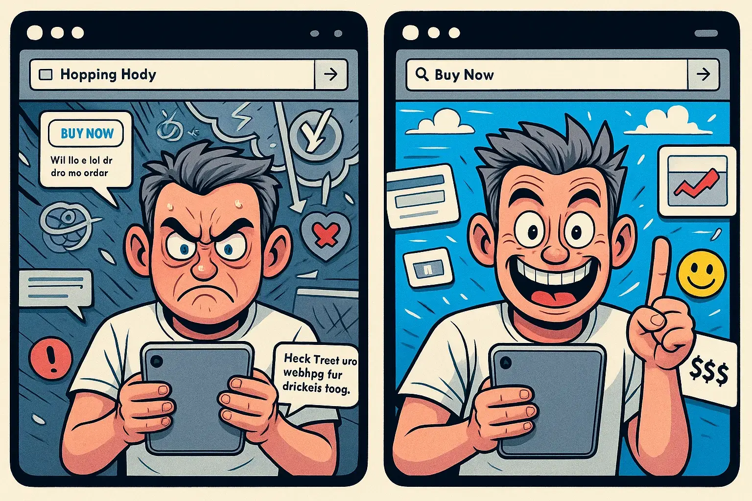
Ever clicked on an ad promising “Free SEO Audit” only to land on a generic services page? That disconnect kills conversions.
-
Single, clear CTA: Pick one goal per page (e.g., “Get Your Free Audit”).
-
Logical flow: Headline → Benefits → Social proof → CTA.
-
No distractions: No sidebars, no pop-ups begging for unrelated email sign-ups.
Real fix: Read your homepage out loud. Could Grandma follow your instructions to the CTA in under 10 seconds? If not, simplify.
3. Trust Won’t Be Assumed—You Have to Earn It
People are skeptical. They’ve been burned by “too good to be true” offers before. You need to show you’re legit:
-
Testimonials & case studies: Real quotes with photos or logos.
-
Security badges: SSL, payment logos, industry accreditations.
-
About section: A friendly photo, a quick “why I started” story.
Real fix: Shoot a 30-second selfie video introducing yourself. Embed it above the fold—or pick one testimonial and put it in the hero area. Instant human touch.
4. Mobile Experience Isn’t Optional
Mobile traffic isn’t “growing”—it’s already the majority. If your buttons are too small, text unreadable, or menus impossible to tap, you’re blocking your biggest audience.
-
Thumb-friendly buttons: At least 44×44 pixels.
-
Legible text: 16px minimum, no squinting required.
-
Streamlined content: Trim down to essential info.
Real fix: Pull out your phone, open your site, and try to book or buy something. Watch what frustrates you and fix it first.
5. Speed Wins Every Time
A slow page is like a closed door. We’ve all clicked away from a site that took forever to load. Every second counts:
-
Optimize images: Compress without losing clarity.
-
Minify scripts: Cut out unnecessary plugins.
-
Use caching/CDN: Serve files faster.
Real fix: Run a free speed test, then tackle the two biggest red-flag issues it highlights. You’ll see bounce rates drop overnight.
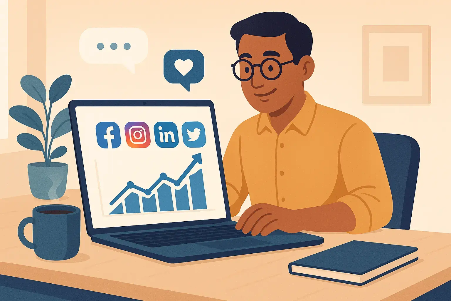
6. Consistency Builds Confidence
If your Facebook ad feels fun and cheeky, but your website reads like a legal contract, visitors get whiplash—and leave. Keep your:
-
Colors & fonts: Stick to a simple palette and one or two font families.
-
Tone of voice: Match your social posts, emails, and site copy.
-
Imagery style: Real photos or consistent illustrations, not a grab-bag.
Real fix: Gather screenshots of your last five social posts and compare them to your homepage. Spot any personality mismatch? Fix it.
Wrapping It Up
Your website isn’t just a brochure—it’s your hardest-working salesperson, available 24/7. A few honest tweaks—cleaning up your design, guiding visitors clearly, earning trust, optimizing for mobile and speed, and staying consistent—can turn curious clicks into real customers.
Feel overwhelmed? Start with one section (like your CTA area), make it cleaner, faster, and more human. Then move on to the next. Before long, you’ll have a site that feels friendly, professional, and built to sell.
If you’d rather skip the trial and error and jump straight to a site that converts, let’s chat. We’ve helped dozens of businesses turn their websites into sales engines—and we’d love to do the same for you.